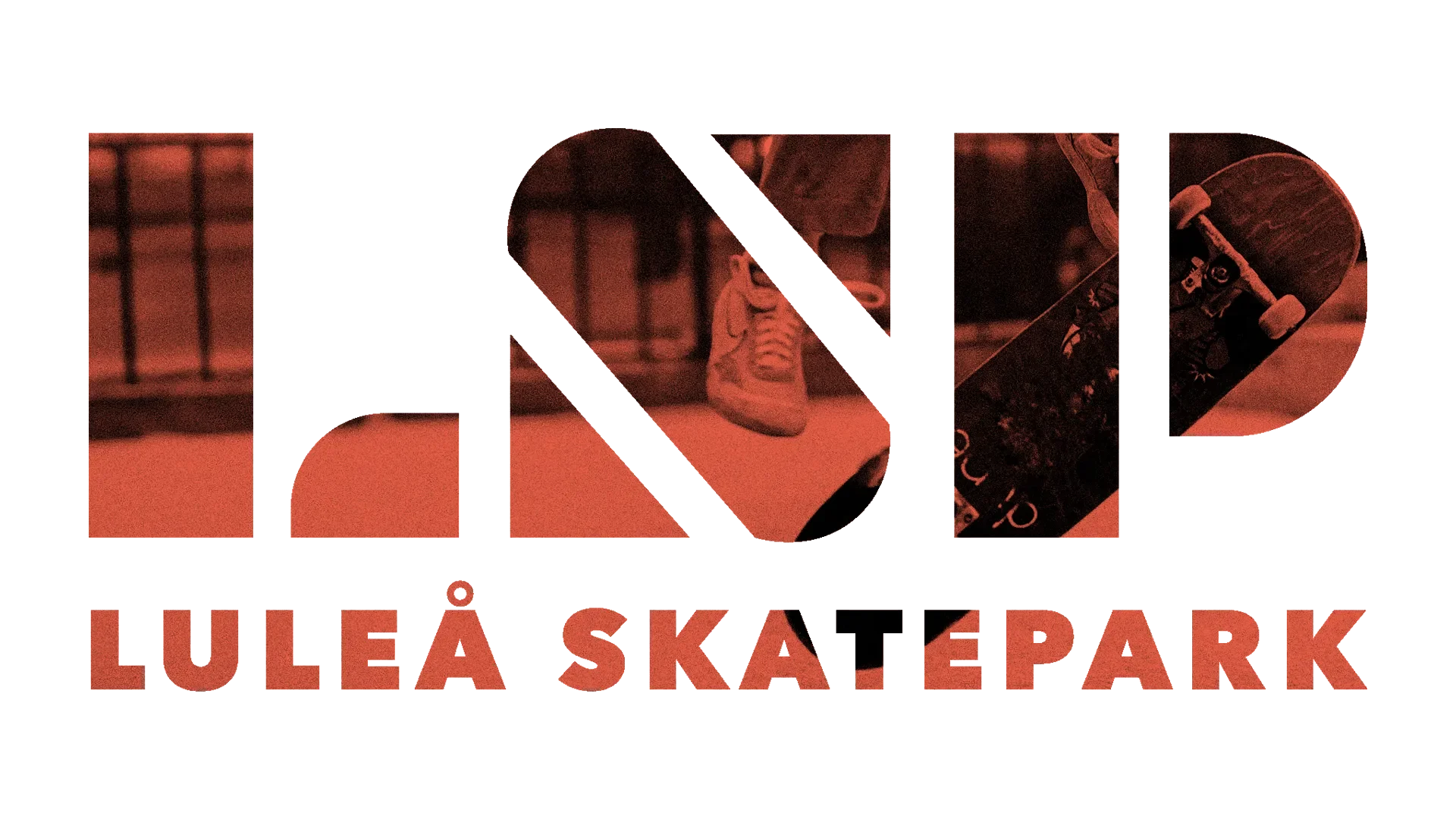
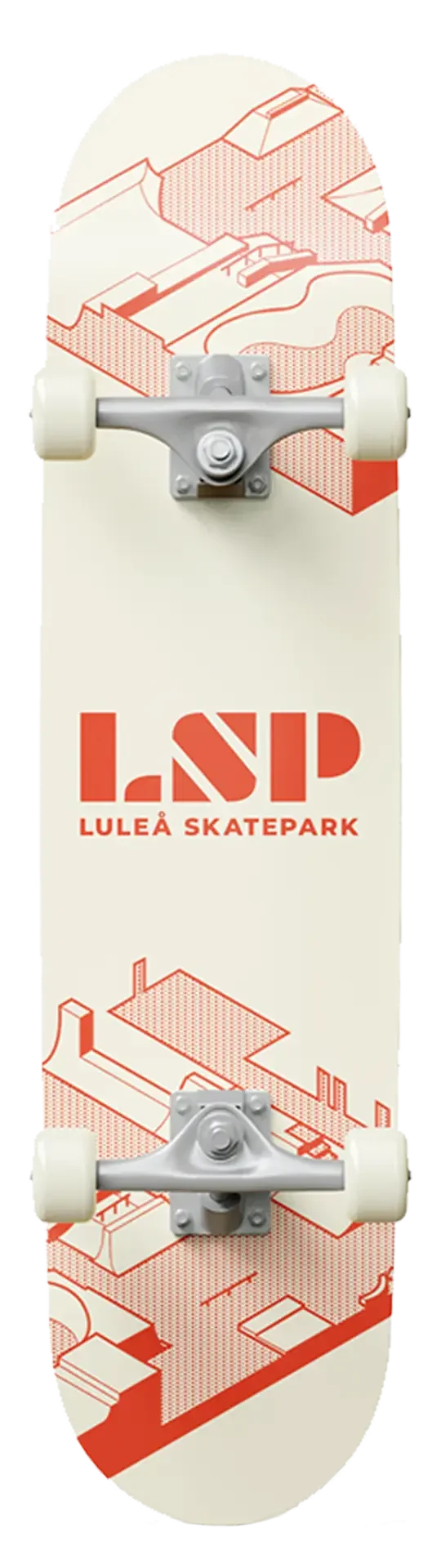
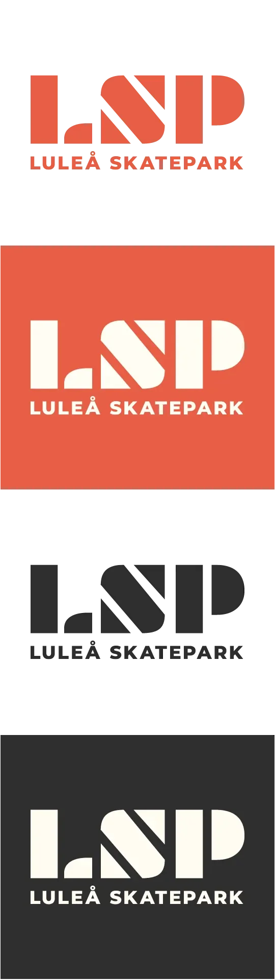
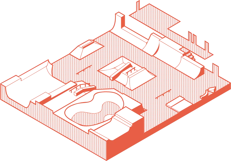
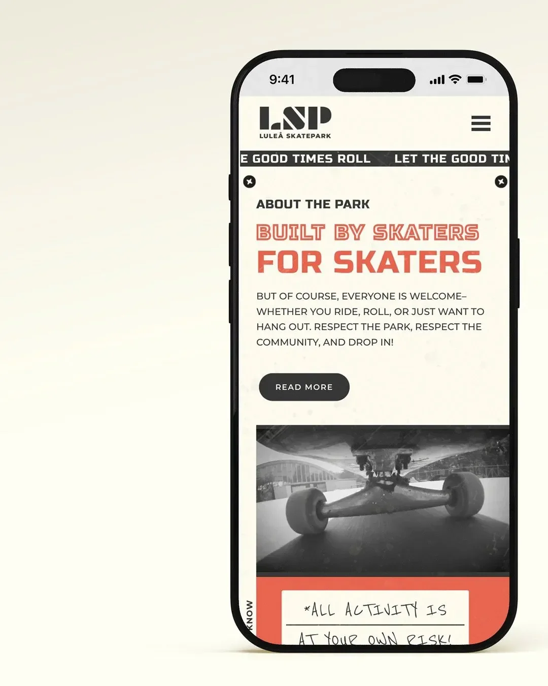
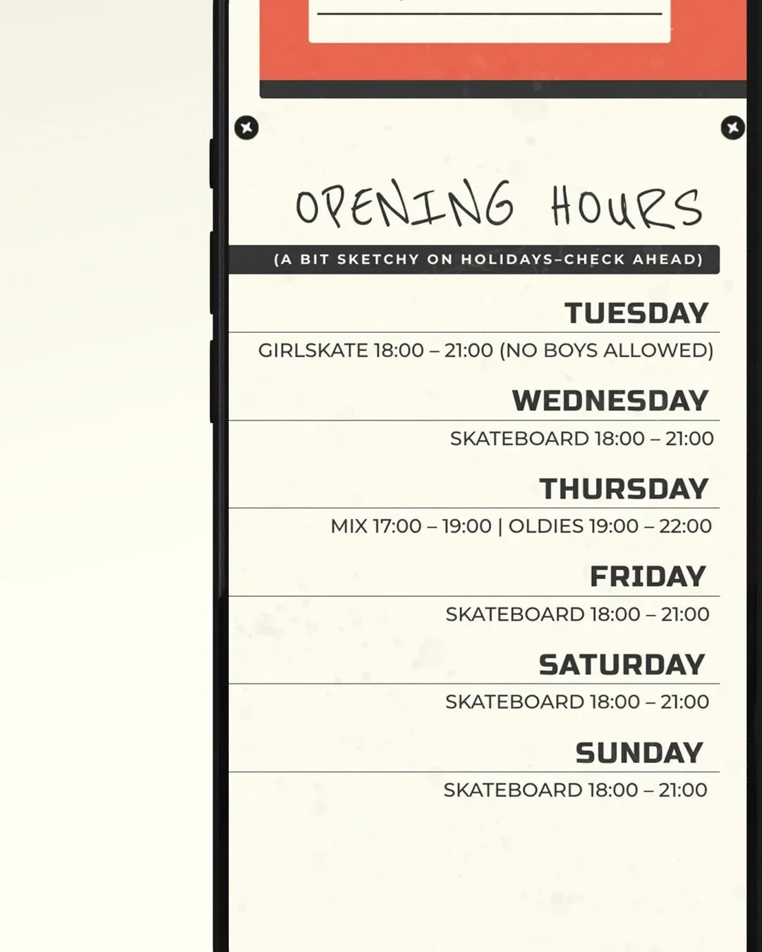
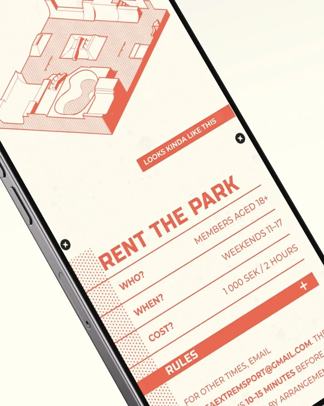
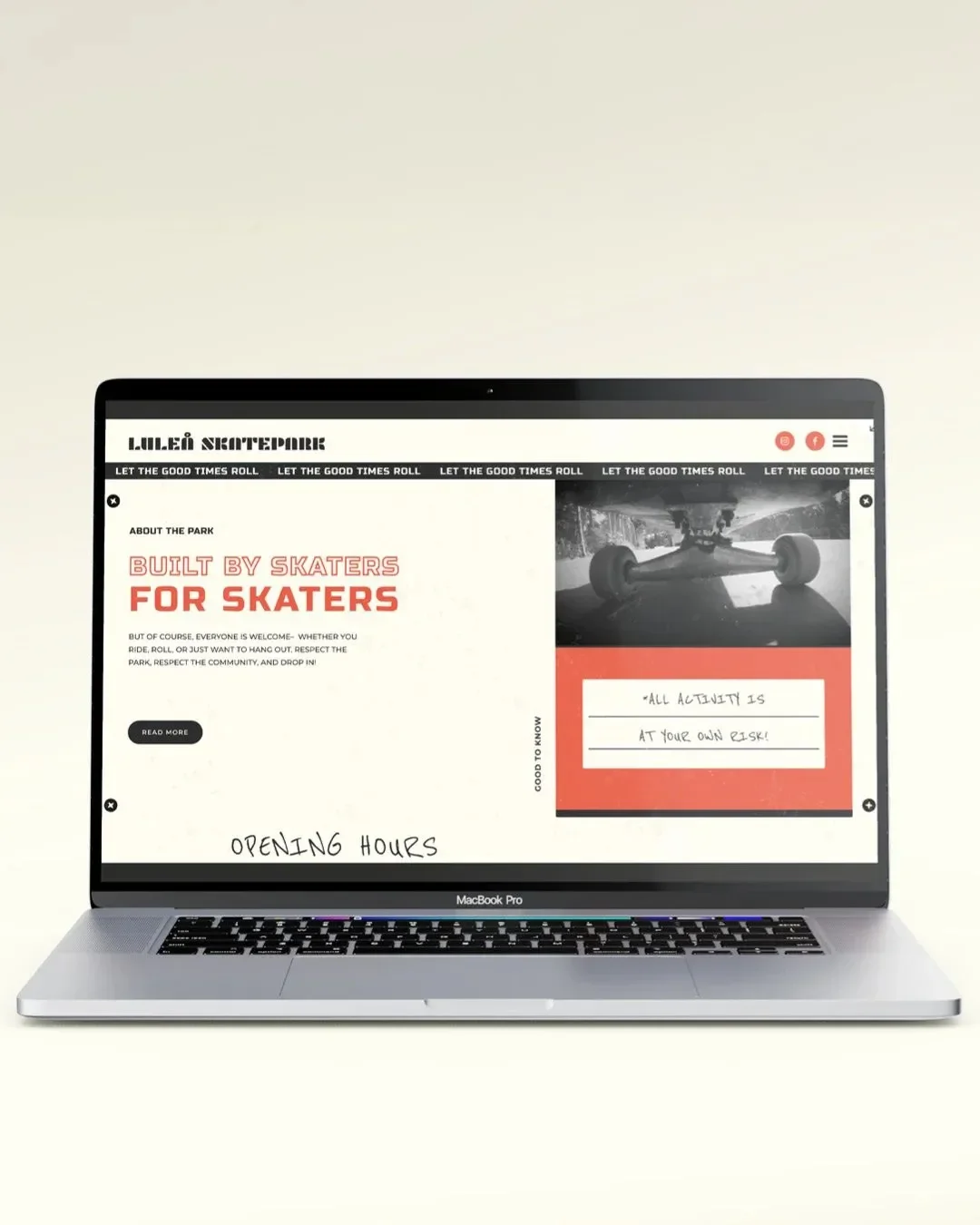
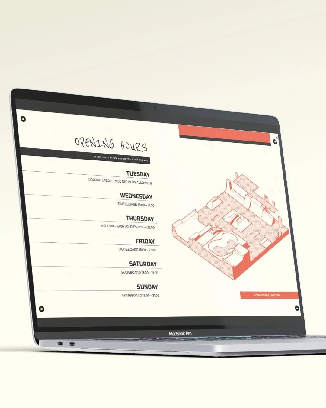
• We created the brand and website for Luleå Skatepark. The vibe? Straight from the VHS era, when tapes were traded, names were hand-scribbled, and style spoke louder than sponsors. The identity is raw and honest, built to let the park’s own personality shine. The site flows like a good session: fast, loose, and full of unexpected turns. We also built an isometric map of the whole park (part teaser, part cheat code) to get people hyped before they even set foot inside.

Luleå Skatepark

Luleå Skatepark logo in bold geometric typography with photo texture of skateboard and skater inside the letters, representing the park’s modern urban brand identity.
White skateboard featuring red line-art illustration of a skatepark and the Luleå Skatepark logo, designed as part of the park’s visual identity and branding.
Luleå Skatepark logos in four different color variations. Orange, Cream on Orange background, Black, and Cream on Black background.
Isometric illustration of Luleå Skatepark layout showing ramps, bowls, and street sections, designed as a 3D-style map for the skatepark’s visual identity.
Handwritten text reading “Built by skaters, for skaters” in black marker style font on a cream background, emphasizing community-driven skatepark design.
Andersson Tree Care

Next case

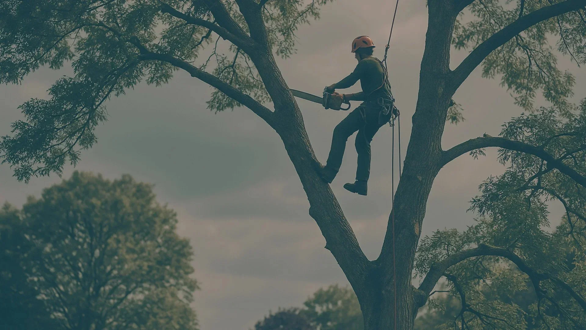
Down to earth branding & website for Andersson Tree Care

We saw you looking...

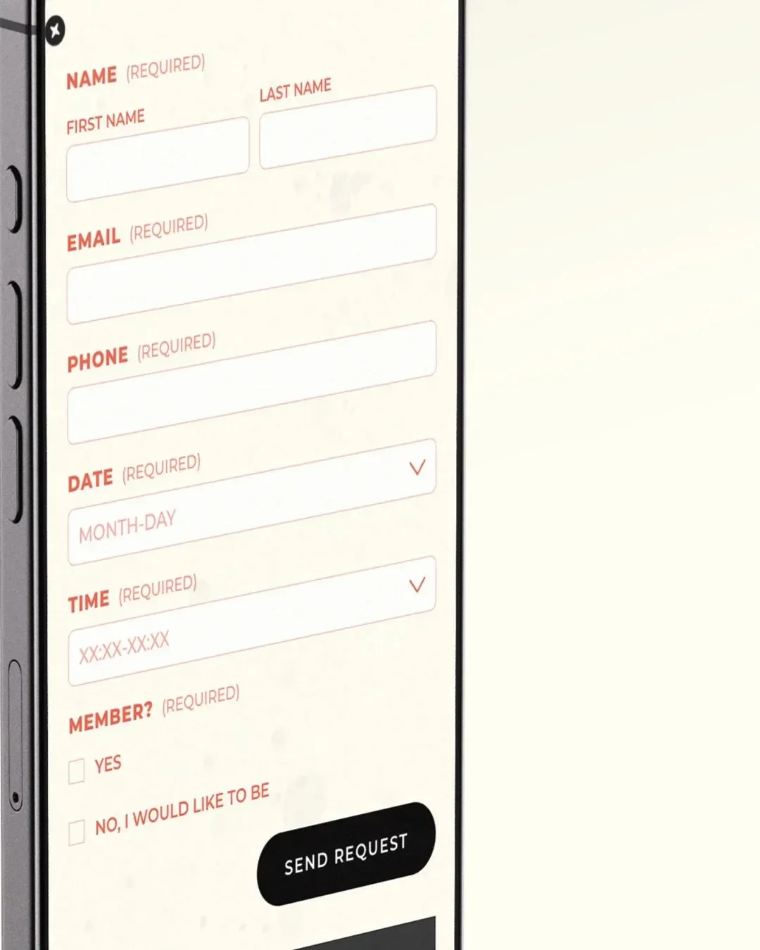
...and hey, no pressure — but we’d look pretty good together. Got ideas? Questions? A gut feeling? Slide into our inbox and let’s see what happens.

Make contact